


CERVEZA INDIO — BARRIOS DE MÉXICO
Local Culture Through Illustration
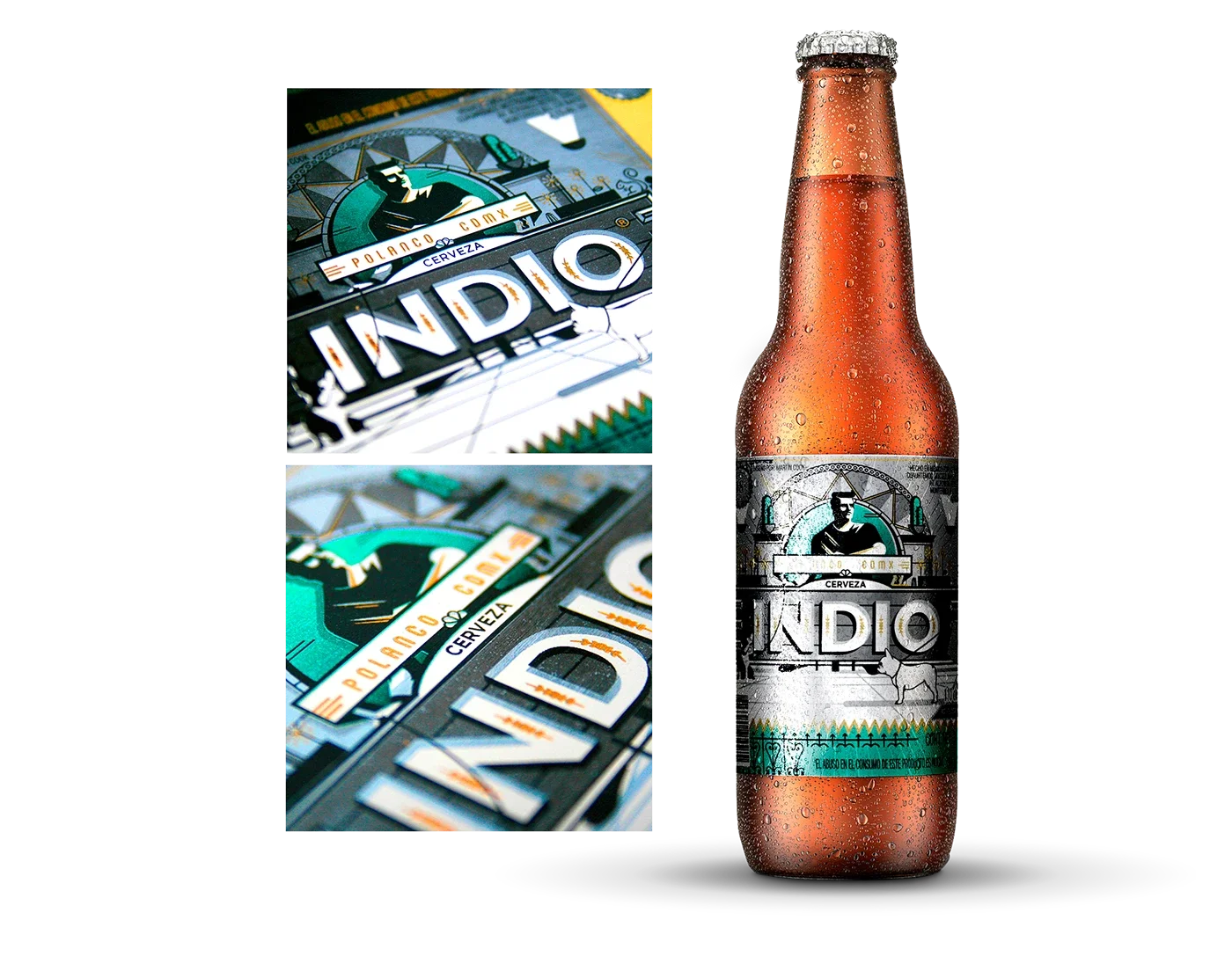
Cerveza Indio launched an initiative inviting illustrators from across Mexico to reinterpret the brand through the lens of their own neighbourhoods.
I contributed creative direction for an interpretation representing Polanco, one of Mexico City’s most distinctive districts. The project replaced the traditional Aztec warrior on the Indio label with a portrait of the modern Polanco resident, reflecting the character and lifestyle of the area.
Where the original symbol spoke to Mexico’s ancient past, this interpretation explored the contemporary identity of the neighbourhood — from its colonial Californiano architecture and café culture to the everyday scenes of residents walking designer dogs through tree-lined streets.
The design used a restrained palette that allowed the metallic foil of the label to emerge through the illustration, subtly transforming yellow and grey into gold and silver.
The result was a modern reinterpretation of the Indio label that connected the brand to the evolving identities of Mexico’s urban communities.