
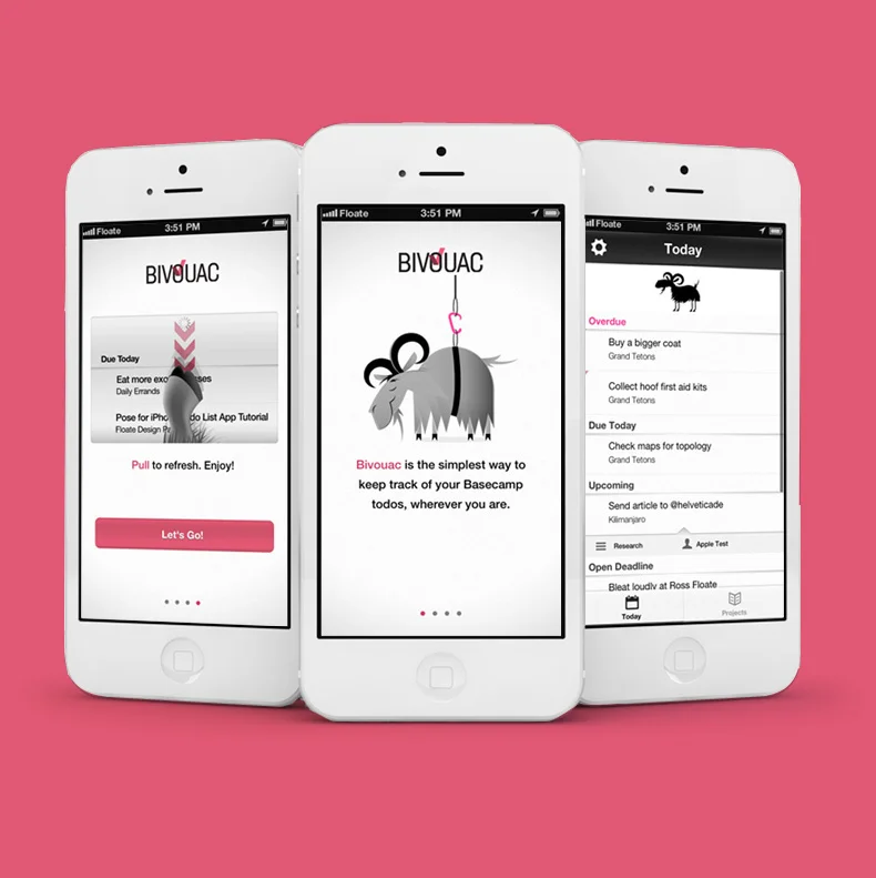
During my time at Floate, we designed, and built a hassle-free app to keep our Basecamp tasks up-to-date and maintain visibility on project status across our team. As part of the app’s design process, we realised early on that the simplicity needed a strong visual identity and personality to help it stand out in the App Store. It became my job to make this small app a memorable utility bursting with personality
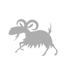
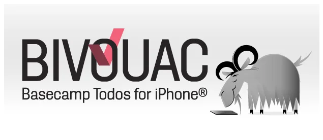
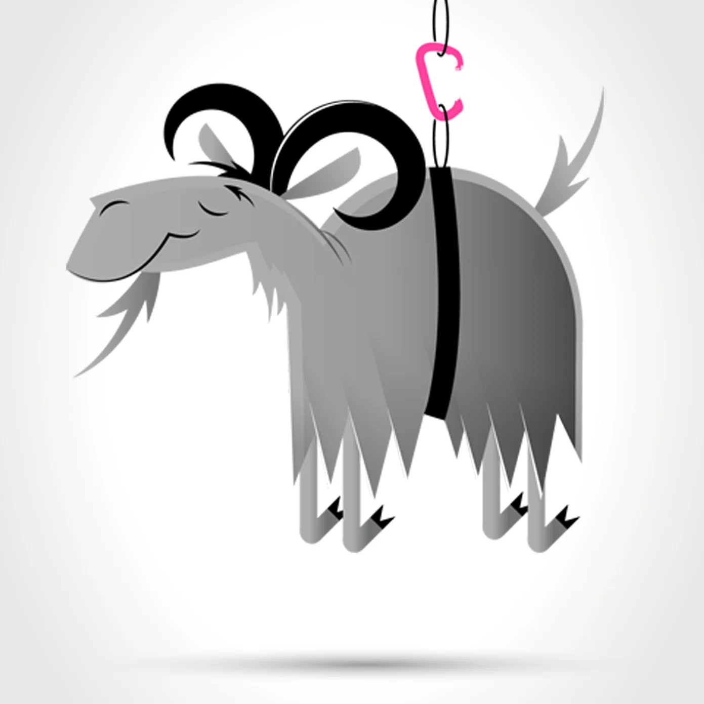
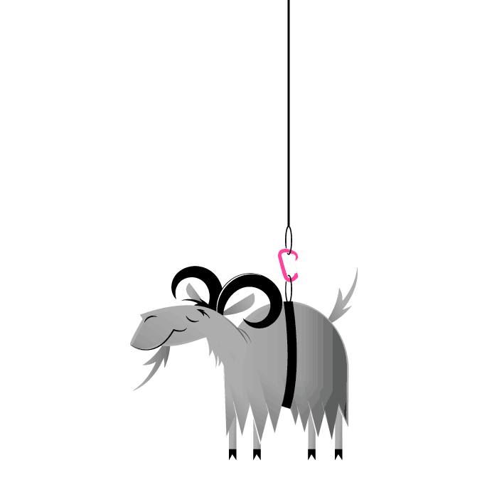
Design: After prototyping a few characters based around Basecamp’s and Bivouac’s identities and metaphors, we settled on an anthropomorphised mountain goat. Invoking qualities of simplicity, stability and calm, the Bivouac goat’s personality is a rather transparent communiqué of the goals of the app. The Bivouac Goat’s style and shape is uses a Disney-esque vector illustration style to create shapes that would be immediately recognisable at small sizes (like in an app icon)
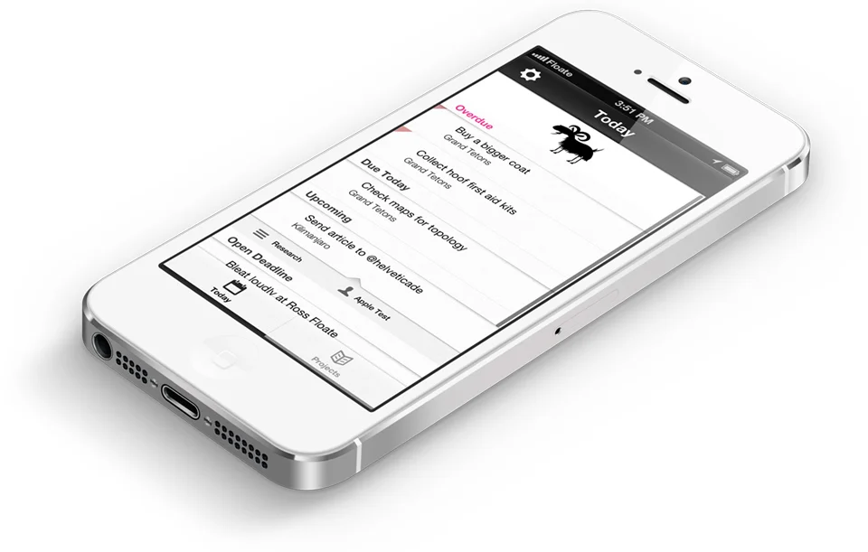
Bivouac’s goat ended up serving two purposes within the app. He illustrated the app’s introduction and was used to delight users, popping up unexpectedly within the app. As a result, Bivouac stands out in the App Store as a playful alternative in a market of serious competing Basecamp apps, whilst still maintaining a close connection to the aesthetic of the service it relies on.