

AFL ORIGIN
Taste as Strategy
The brief was simple.
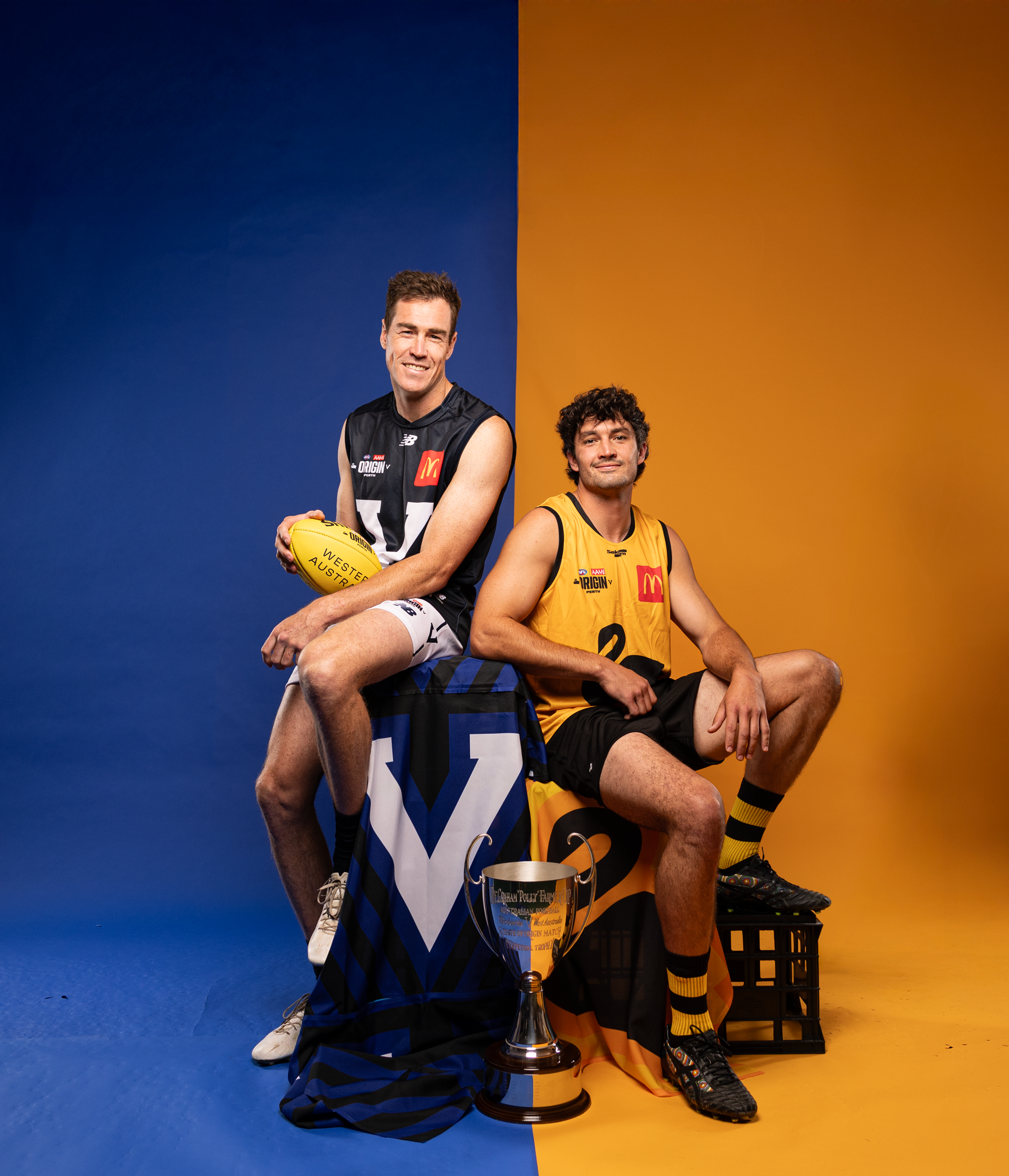
Reignite tribalism.
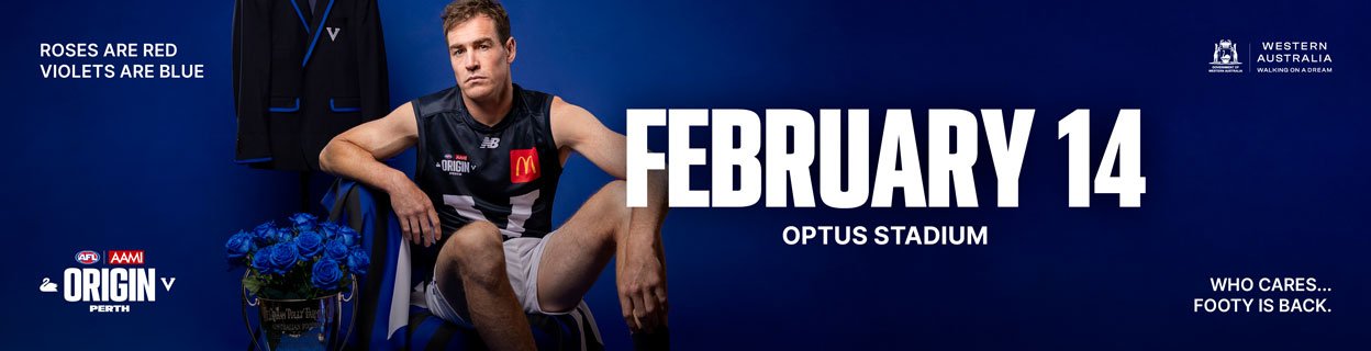
Sell out Optus Stadium.
Make Origin matter again.
This wasn’t a campaign.
It was a resurrection.
The creative challenge was to bring Origin back in a way that felt historic, not nostalgic.
Tribal, not exclusive.
Premium, not detached.
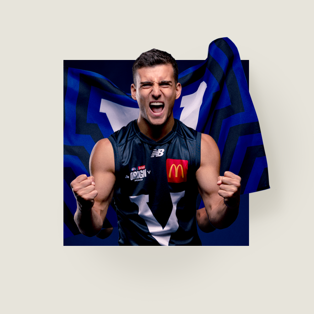
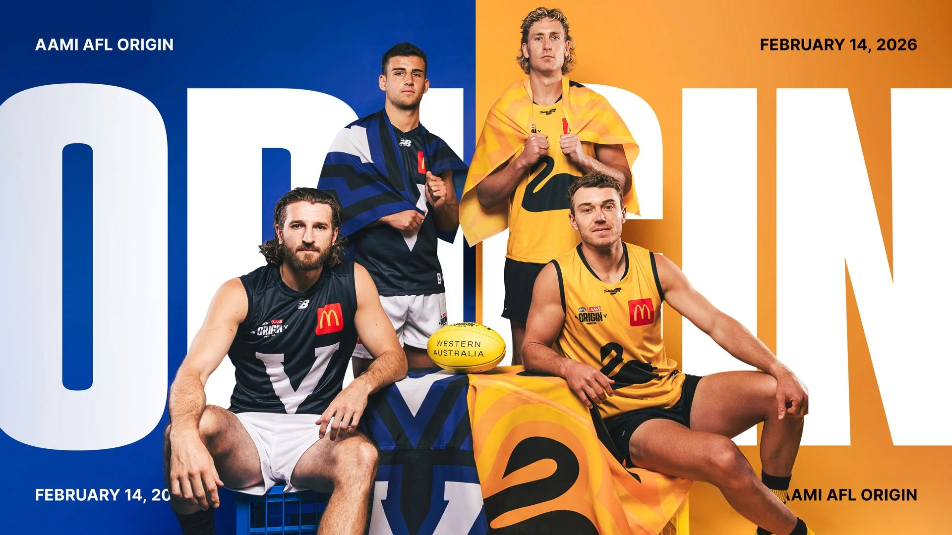
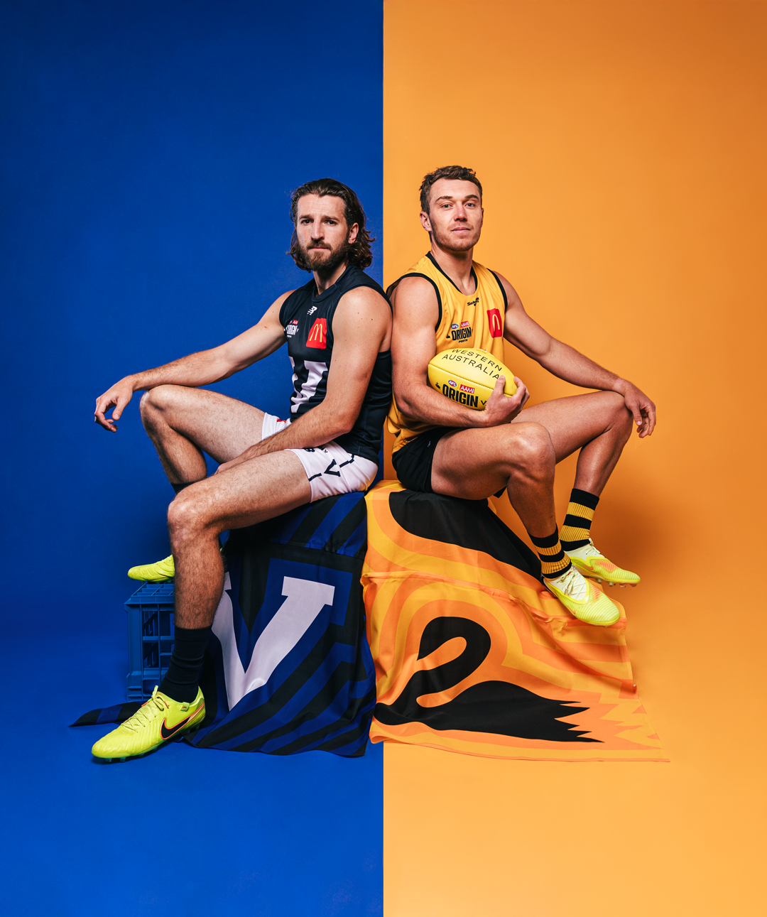
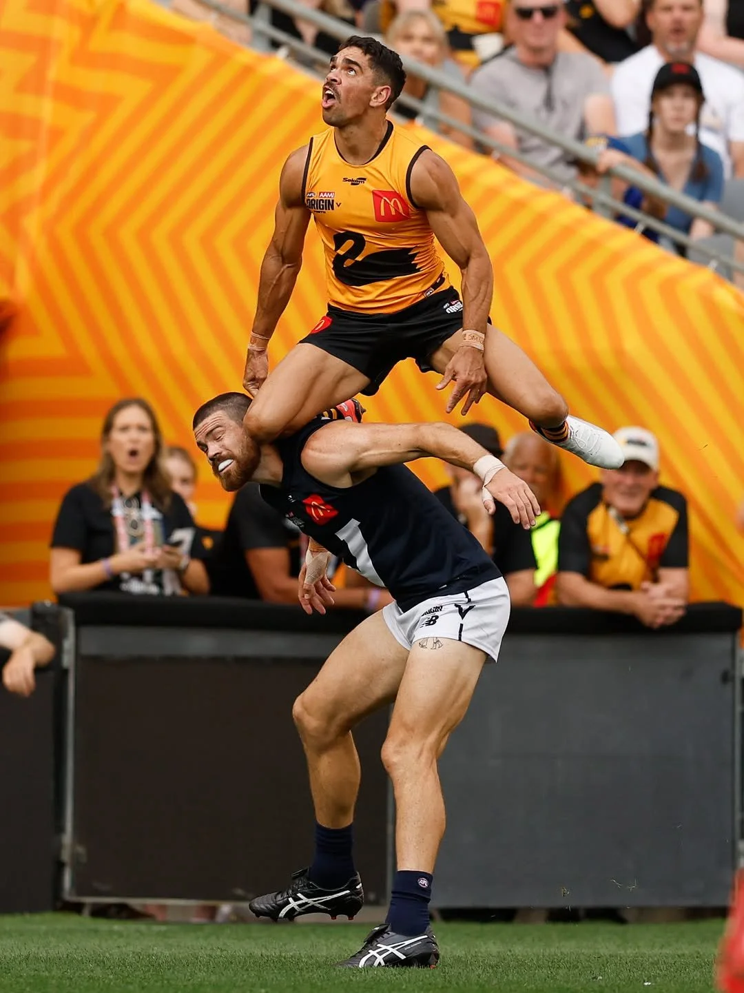
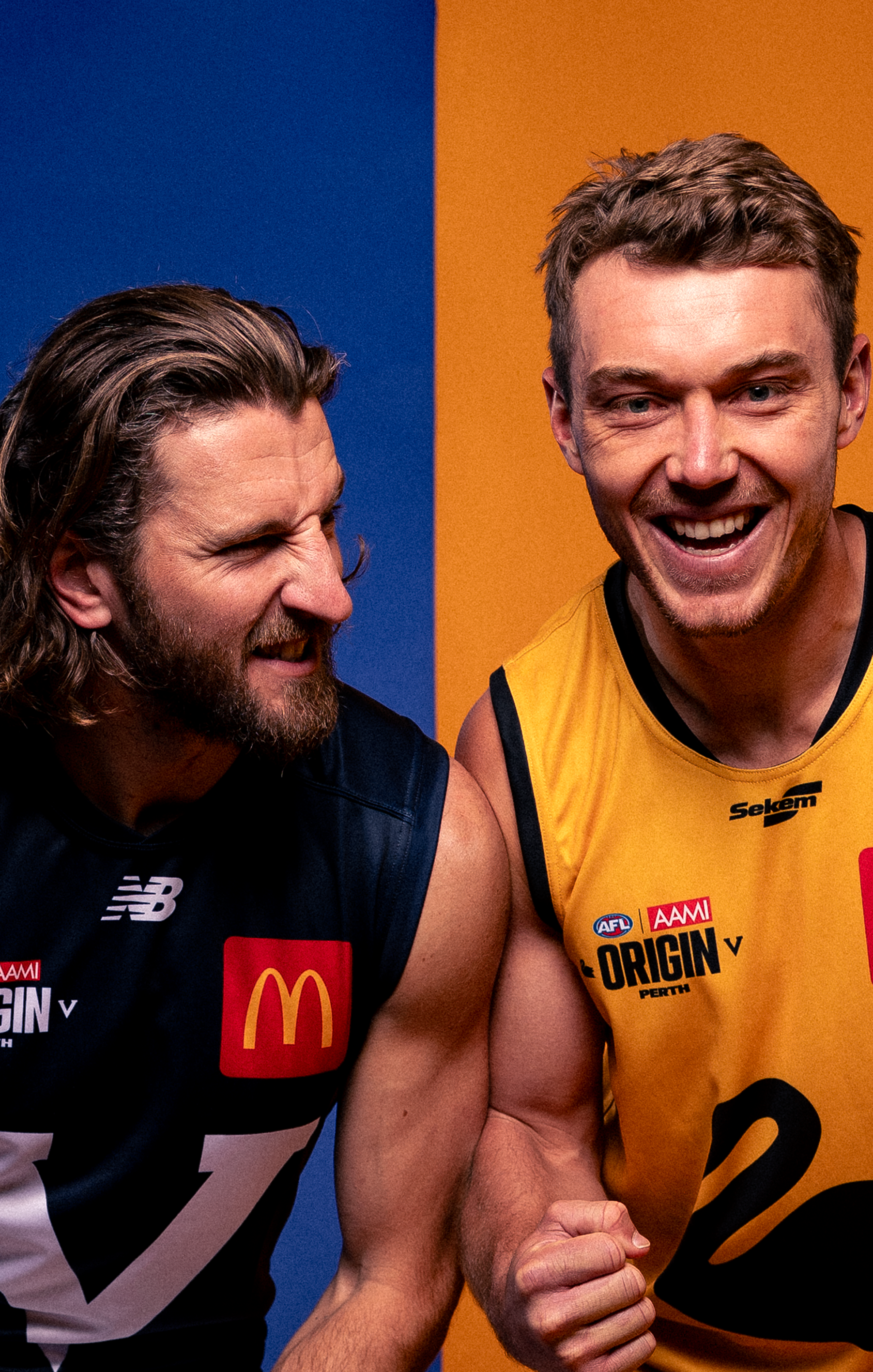
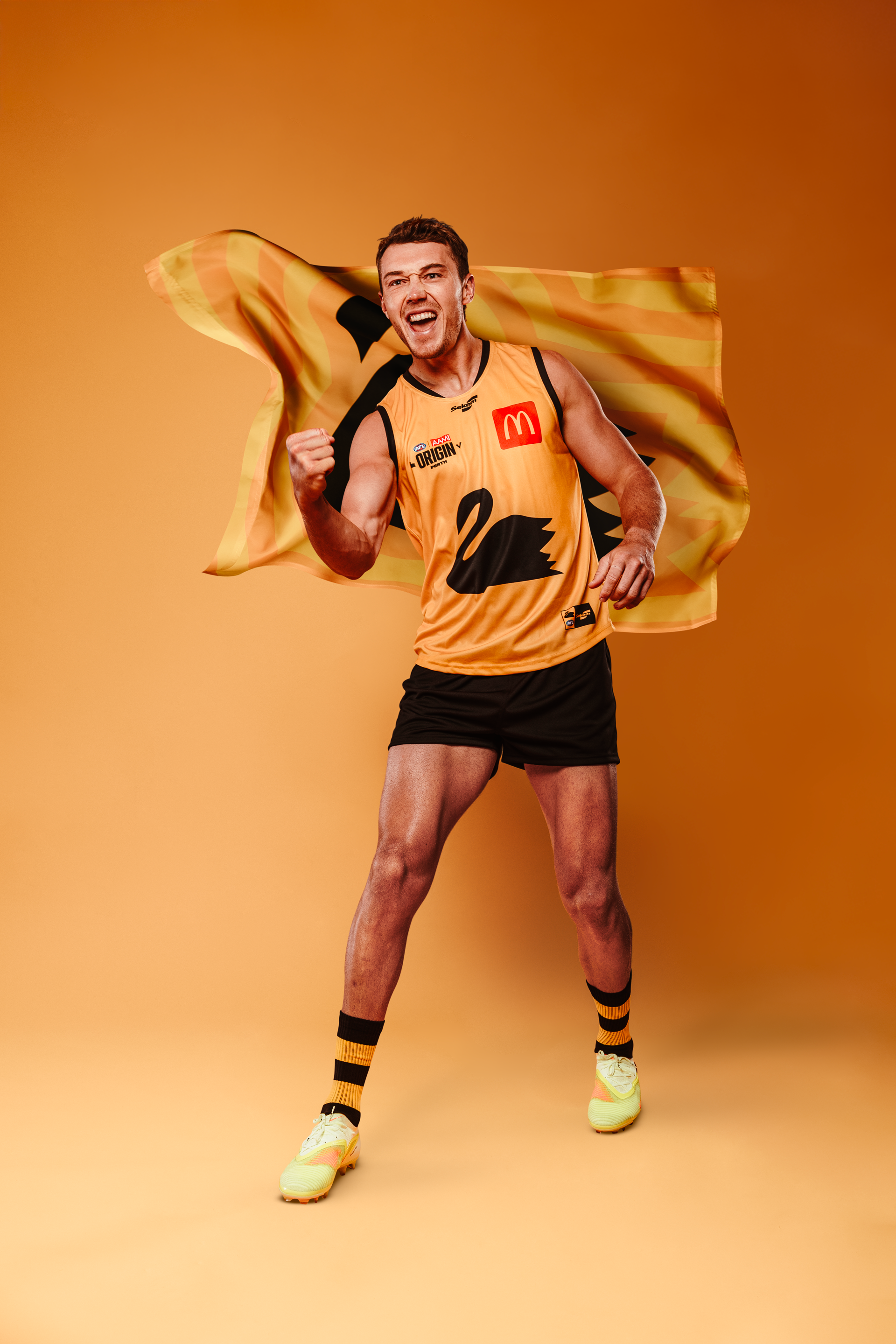
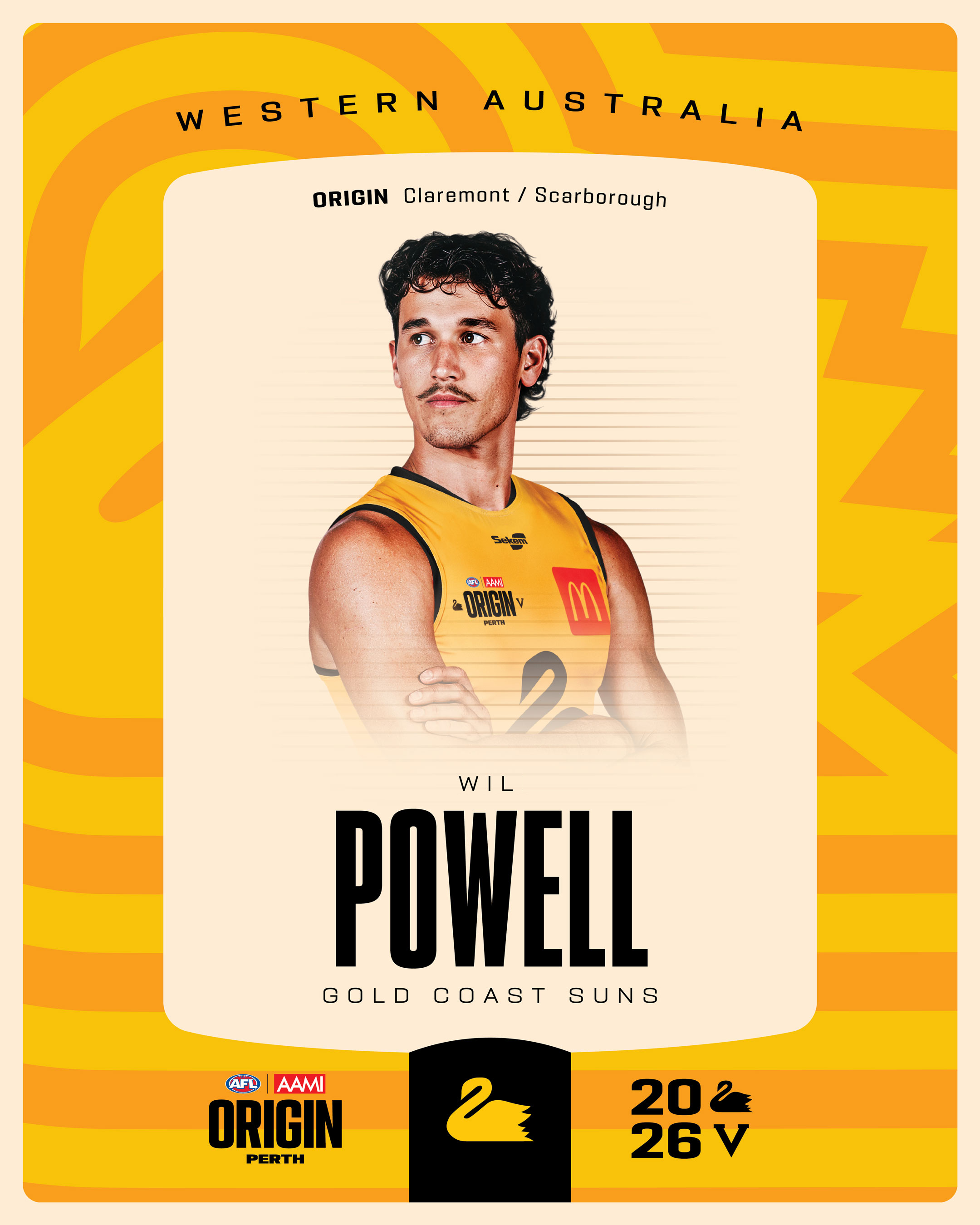
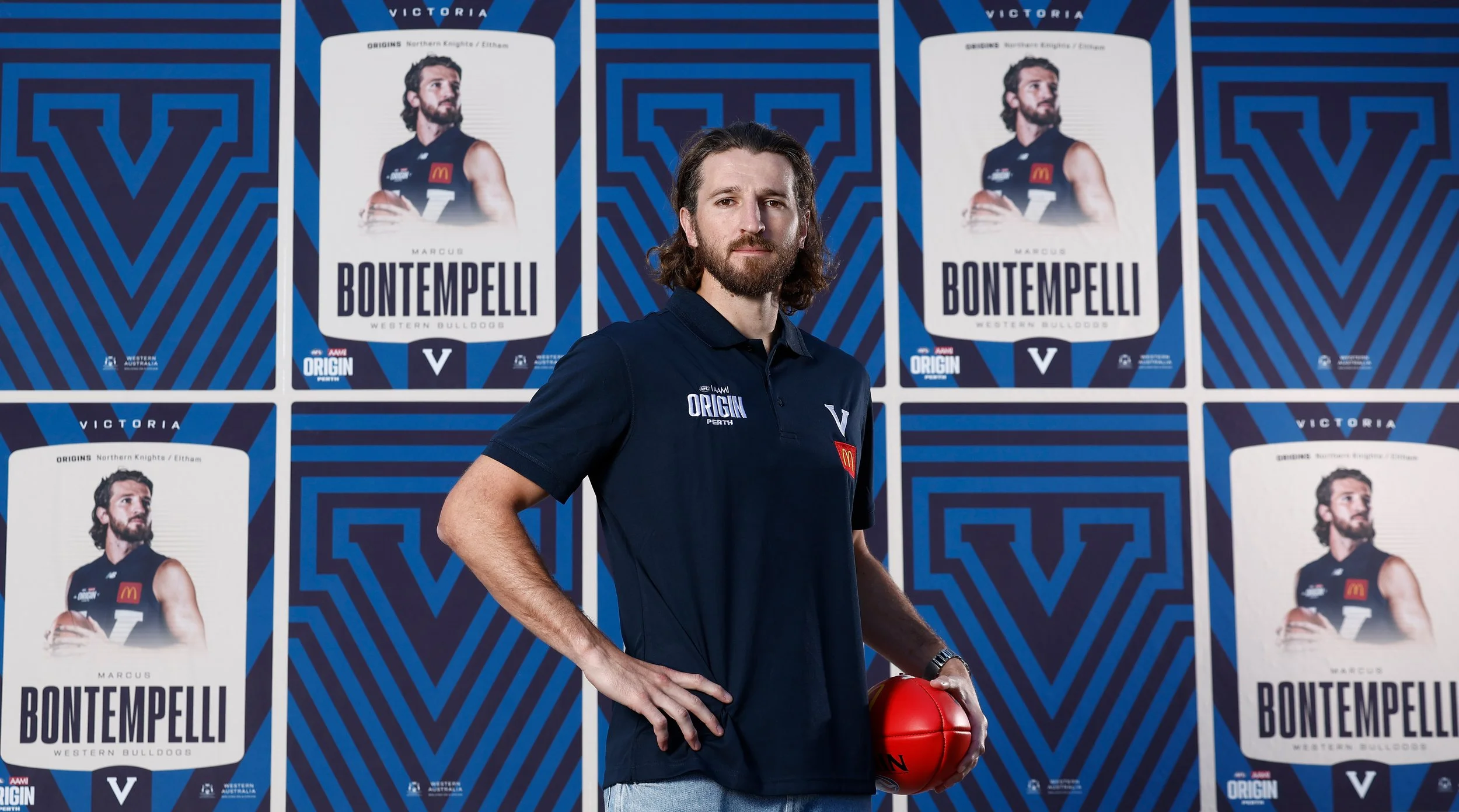
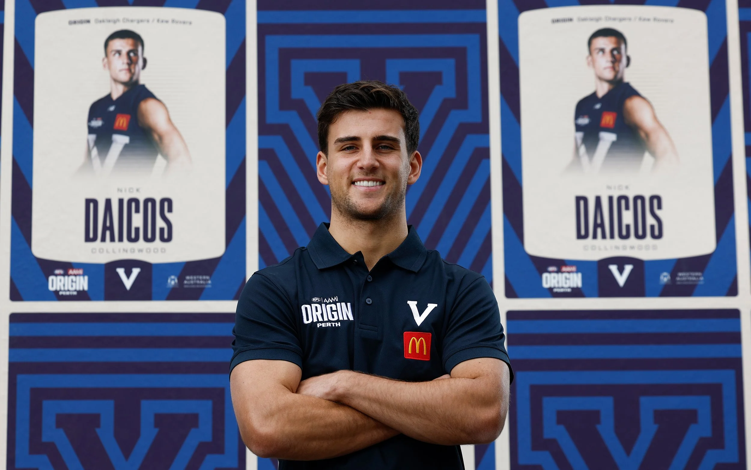
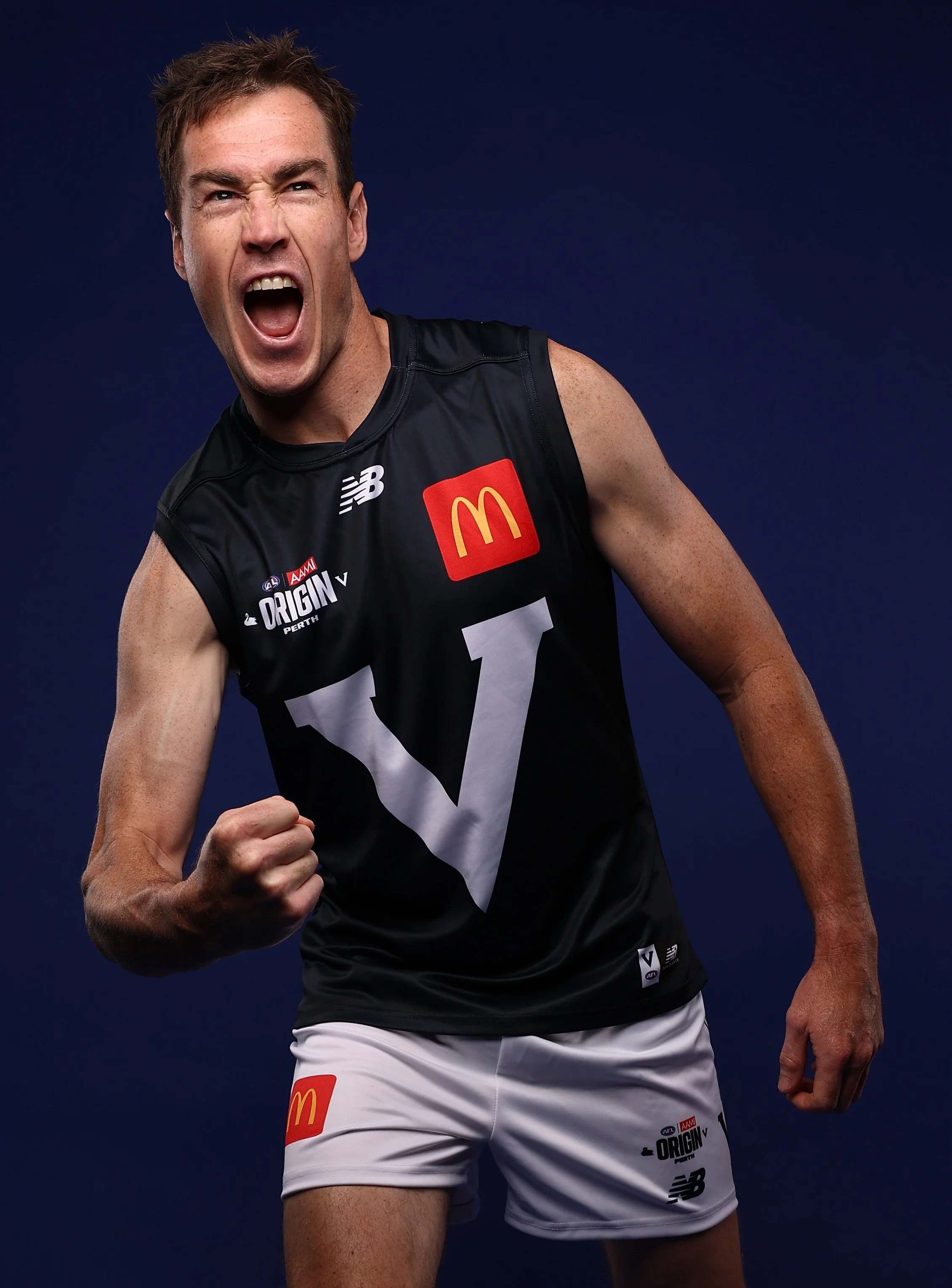
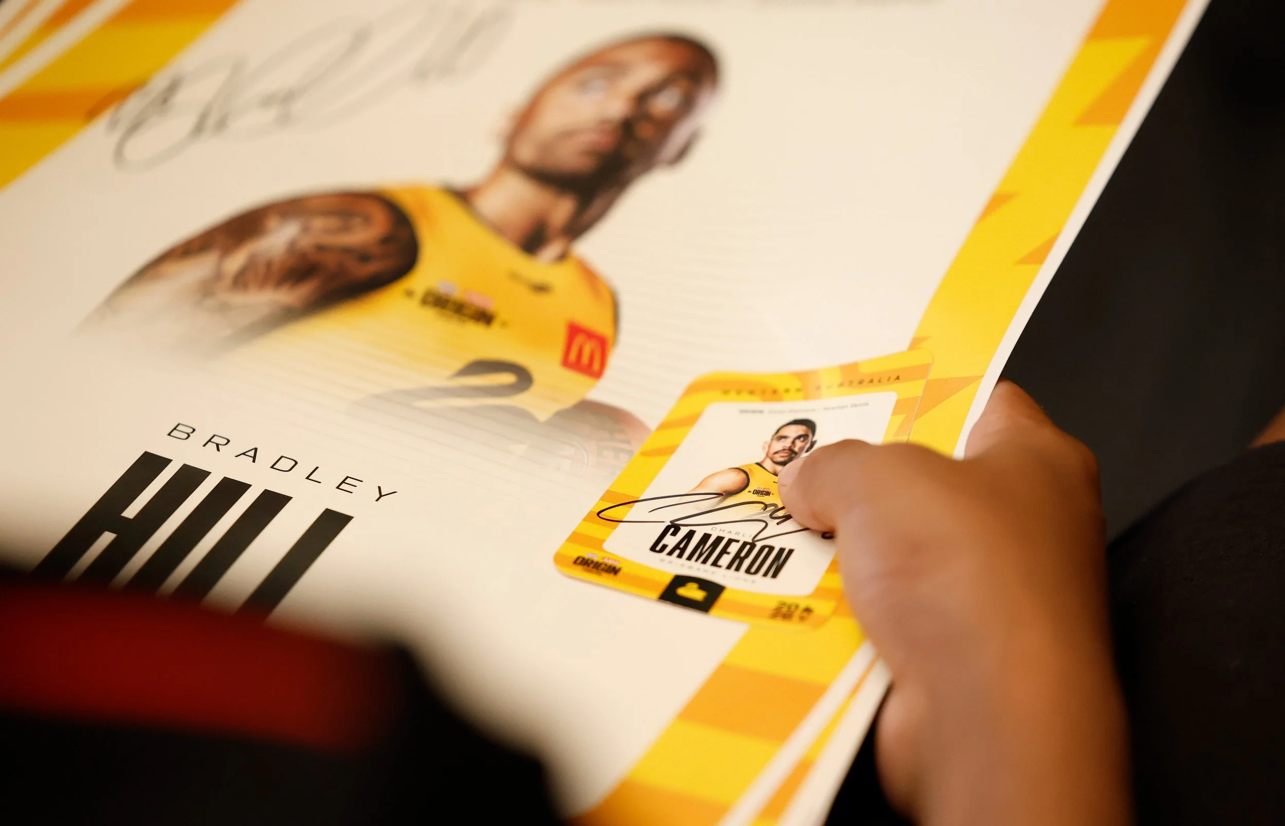
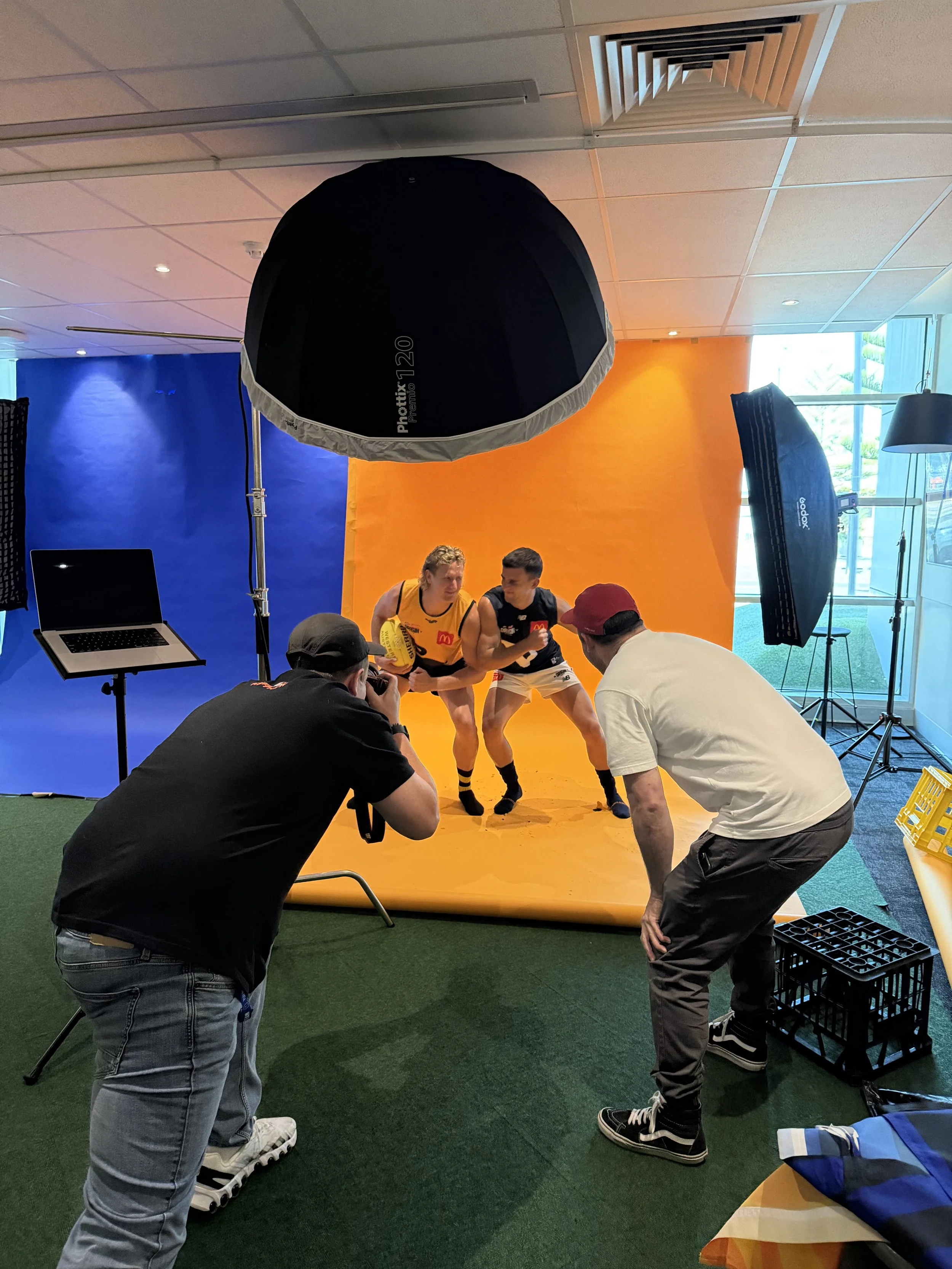
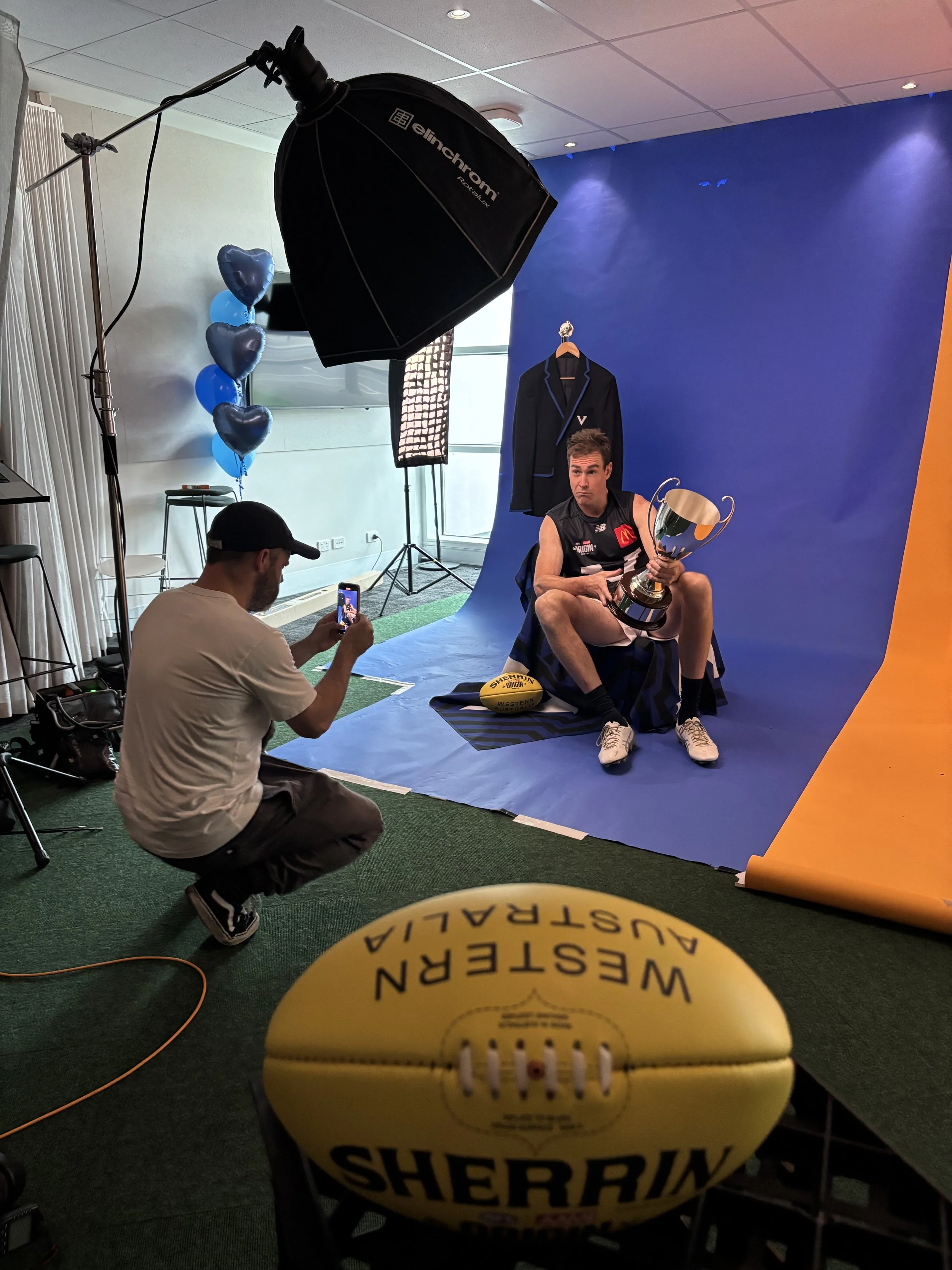
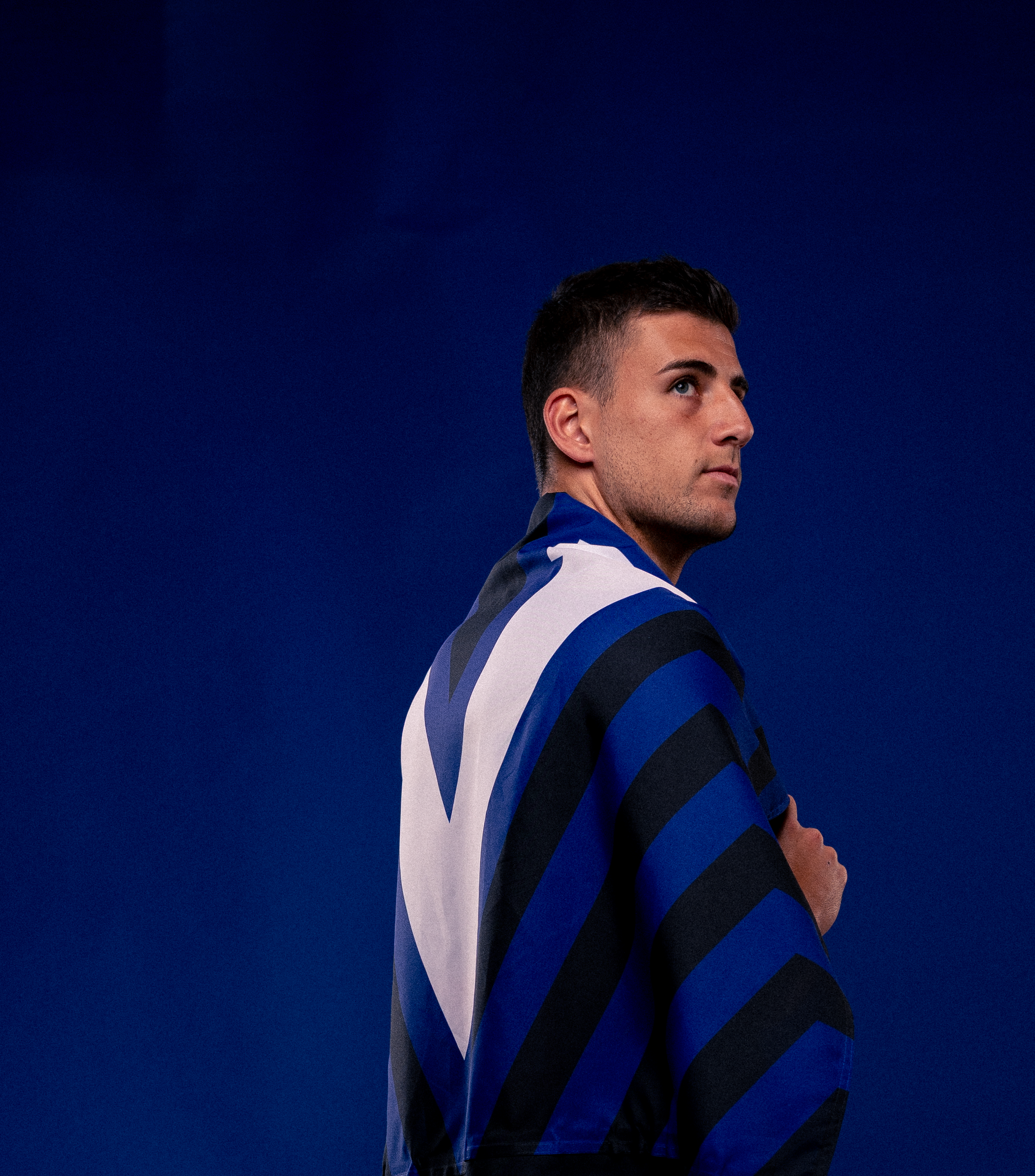
I led the development of a visual system built around the core symbols of Origin — allowing the rivalry itself to carry the story.
Patterns grew from these hero marks, creating movement and energy without losing their roots. The result was a design language that felt both traditional and contemporary, capable of scaling seamlessly across broadcast, retail, digital and live environments.
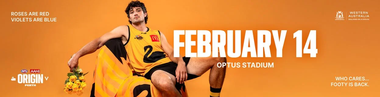
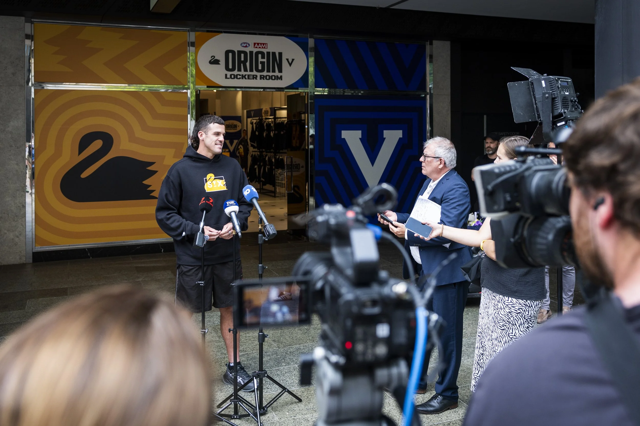
The system allowed the campaign to build momentum over time, from early announcements through to game day, with each creative release reinforcing the identity of Origin.
It also enabled rapid pivots: player announcements without physical access, PR moments that could land quickly, and a consistent visual language that compounded brand equity with every drop.
By the time the first siren sounded, Origin had already come back to life.
Origin stopped being a campaign and became an experience.